自定义装修组件
S2B2C 白洞版 · 自定义装修组件
自定义装修组件
Section titled “自定义装修组件”自定义装修组件
Section titled “自定义装修组件”装修功能实现原理
Section titled “装修功能实现原理”装修功能基本上是在前端实现的,后台提供接口保存一个装修页面的配置信息,前端页面通过指定的装修页面id请求到配置内容,然后渲染出来。
装修组件的组成
Section titled “装修组件的组成”- 后台管理系统中装修组件:用于在后台管理页面配置、预览装修内容在前端的展示效果;
- 前端项目中的装修组件:用于在C端(PC端、移动端)请求到装修数据后的展示;
PC端自定义装修组件
Section titled “PC端自定义装修组件”PC端装修功能目录说明
Section titled “PC端装修功能目录说明”在后台管理项目中,PC端装修功能目录: 商家端: /src/views/modules/multishop/decorate/create ,平台端: /src/views/modules/platform/decorate/create
目录概览:
create├─common-component├─edit│ └─components│ ├─all-can-use-components 所有可用组件配置。每一个装修组件主体都要引入到这里,并且完成配置信息;│ ├─basic-component 基础组件目录│ ├─component-management 组件管理组件│ ├─decorate-navbar 装修页面的导航条│ ├─extend-component 扩展组件目录│ ├─marketing-activities 营销活动组件目录│ └─right-config-message 右侧公共配置组件。每一个装修组件的配置模块都需要引入到这里└─select-decorate 预览装修页面后台管理页面中目前根据组件类型划分了三种类型的组件,在项目代码中对应其目录名称:
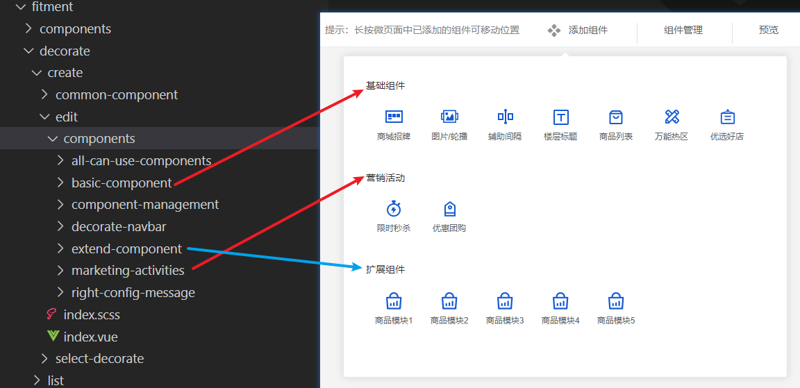
首先确认要新增的组件类型,在对应目录创建新的组件目录。pc端装修组件目录固定配置:
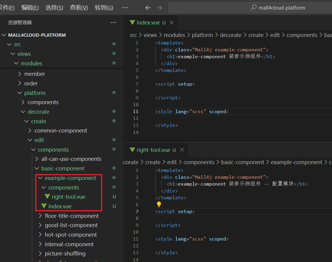
组件名称├─components│ └─right-tool.vue 组件右侧的配置信息配置└─index.vue 组件内容这里在 基础组件 中新增一个装修示例组件 example-component ,则在 basic-component 创建如下内容
然后将这个组件以及组件的配置文件分别添加到 all-can-use-components 和 right-config-message ,并完成相关配置
-
添加组件:打开
create/edit/components/configComponent.js新增以下代码export const configComponentList = [// 新增该配置项{type: 'example_component', // 当前组件类型(唯一)currentType: 'basic', // 当前组件属于哪个栏目(大类)title: 'exampleComponentTitle', // 组件的标题文字pic: pcShopSigns, // 组件的默认图片picActive: pcShopSignsActive, // 组件的激活图片components: 'exampleComponent', // 组件所对应的组件名rightConfigTitle: 'exampleComponentTitle', // 组件所对应的配置信息标题Ref: 'exampleComponentTools', // 这个组件对应的ref,推荐配置为 组件名称+ ToolsrightConfigMessage: {} // 右边配置信息},...]其中
title需根据配置的currentType在 PC端装修国际化配置src/lang/pcdecorate语言包中对应的节点添加键值:示例中为基础组件,则在
baseComponent节点添加对应标题:export default {// 基础组件baseComponent: {...exampleComponentTitle: '示例组件'},// 营销活动marketingActive: {},// 扩展组件extendComponent: {}}rightConfigTitle配置到语言包中componentTitle节点下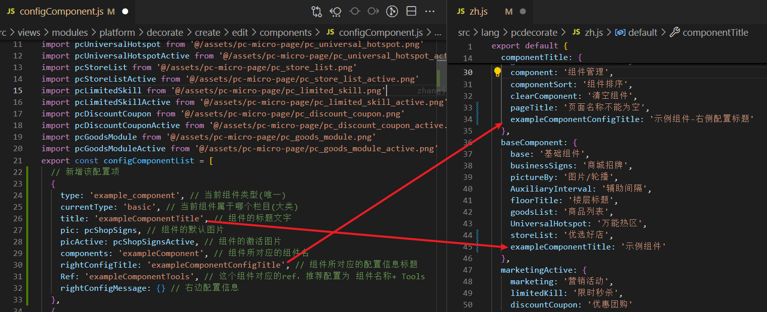
打开
decorate/create/edit/index.vue引入新增的组件并注册<script>// 引入import exampleComponent from './components/basic-component/example-component/index.vue'</script><script setup>const com = shallowReactive({exampleComponent,...})</script> -
添加组件配置:打开
create/edit/components/right-config-message/index.vue新增以下代码<template><divv-for="(item, index) in currentUseComponents":key="index"><!-- 示例组件配置信息 start --><template v-if="item.type === 'example_component'"><example-componentv-show="configMessage.Ref === item.Ref+index":ref="item.Ref+index":current-ref="configMessage.Ref":current-item="configMessage":edit-item="item.rightConfigMessage"@handle-update-message="handleUpdateMessage"/></template><!-- 示例组件配置信息 end --></div></template><script setup>import exampleComponent from '../basic-component/example-component/components/right-tool.vue' // 示例组件配置信息...</script> -
在
decorate/create/edit/index.vue的handleUpdateMessage方法中添加该类型组件,当右边配置内容更新时同步修改装修页面的组件配置// 右边配置信息的改变const handleUpdateMessage = (obj) => {let arr = []arr = JSON.parse(JSON.stringify(currentUseComponents.value))// 头部信息HeaderComponent.value.forEach(v => {if (v.Ref + '-1' === obj.ref) {v.rightConfigMessage = { ...obj.config }}})arr.forEach((item, index) => {if (item.type === 'picture_by') { // 图片轮播if (item.Ref + index === obj.ref) {item.rightConfigMessage = { ...obj.config }}... // 其他组件} else if (item.type === 'example_component') { // 添加这个示例组件。根据创建时设定的组件类型,返回自定义的内容if (item.Ref + index === obj.ref) {item.rightConfigMessage = { ...obj.config }}}}}
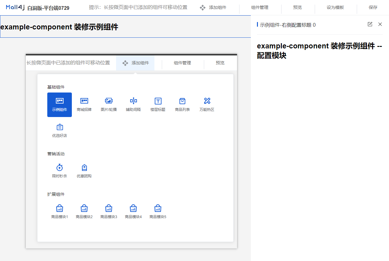
至此,可以在添加组件弹窗中看到这个新增的组件,点击添加可以把组件加到页面上:
页面主体中显示 index.vue ,选中组件右侧会显示配置组件components/right-tool.vue
添加组件功能
Section titled “添加组件功能”新增组件完毕后,接下来就是给组件添加功能。
假设当前组件需要实现一个配置标题的功能,可以配置文本内容、字体的大小和颜色。则在组件中写入以下代码
example-component/index.vue
<template>  <div class="Mall4j example-component">    <!-- <h1>example-component 装修示例组件</h1> -->    装修示例组件配置的内容:    <div      class="example-component-title"      :style="{ fontSize: config.titleFontSize + 'px', color: config.titleColor }"    >      {{ config.title || '请输入标题' }}    </div>  </div></template>
<script setup>// 接收的参数const props = defineProps({  itemComponent: { // 组件信息    type: Object,    default: () => {}  }})
// 当前页面展示的配置const config = ref({})
// 监听组件右侧配置更新,实时同步到当前配置中watch(() => props.itemComponent, (newVal) => {  if (JSON.stringify(newVal.rightConfigMessage) != '{}') {    config.value = {      title: newVal.rightConfigMessage.title,      titleFontSize: newVal.rightConfigMessage.titleFontSize,      titleColor: newVal.rightConfigMessage.titleColor    }  } else {    config.value = {      title: '',      titleFontSize: 16,      titleColor: '#333333'    }  }}, {  deep: true,  immediate: true})</script>
example-component/components/right-tool.vue 组件配置
<template>  <div class="Mall4j example-component">    <!-- <h1>example-component 装修示例组件-配置模块</h1> -->    <el-form      v-model="configForm"      label-width="auto"    >      <el-form-item        label="标题"        required      >        <el-input          v-model="configForm.title"          placeholder="请输入标题"        />      </el-form-item>      <el-form-item label="字体大小">        <el-slider          v-model="configForm.titleFontSize"          :min="12"        />      </el-form-item>      <el-form-item label="字体颜色">        <el-color-picker v-model="configForm.titleColor" />      </el-form-item>    </el-form>  </div></template>
<script setup>
// 当前组件的配置信息const configForm = ref({  title: '', // 标题内容  titleFontSize: 16, // 标题字体大小  titleColor: '#333333' // 标题字体颜色})
// 接收的参数const props = defineProps({  currentRef: { // 当前组件的ref    type: String,    default: () => ''  },  currentItem: { // 点击当前组件回显右边配置信息    type: Object,    default: () => {}  },  editItem: { // 当前已经配置信息    type: Object,    default: () => {}  }})
// 监听组件回显watch(() => props.currentItem, (newVal) => {  if (newVal.currentConfigType === 'example_component') {    if (JSON.stringify(newVal.config) !== '{}') {      configForm.value = { ...newVal.config }    }  }})
// 同步预览区域的方法const emit = defineEmits(['handleUpdateMessage'])
// 监听当前组件配置,发生改变时同步到预览区域watch(() => configForm.value, (newVal) => {  const obj = {    type: 'example_component',    ref: props.currentRef,    config: newVal  }  // 同步到预览区域  emit('handleUpdateMessage', obj)}, { deep: true })
/** * 当前组件的校验方法 * @return {status: boolean, message: string} status为true表示校验通过,否则弹出 message 提示内容 */const handleValidate = () => {  let status  let message = ''  if (JSON.stringify(props.editItem) === '{}') {    status = false    message = '请先配置组件内容'  } else if (!props.editItem.title.trim()) {    status = false    message = '标题不能为空'  } else {    status = true  }  return {    status,    message  }}defineExpose({ handleValidate })</script>
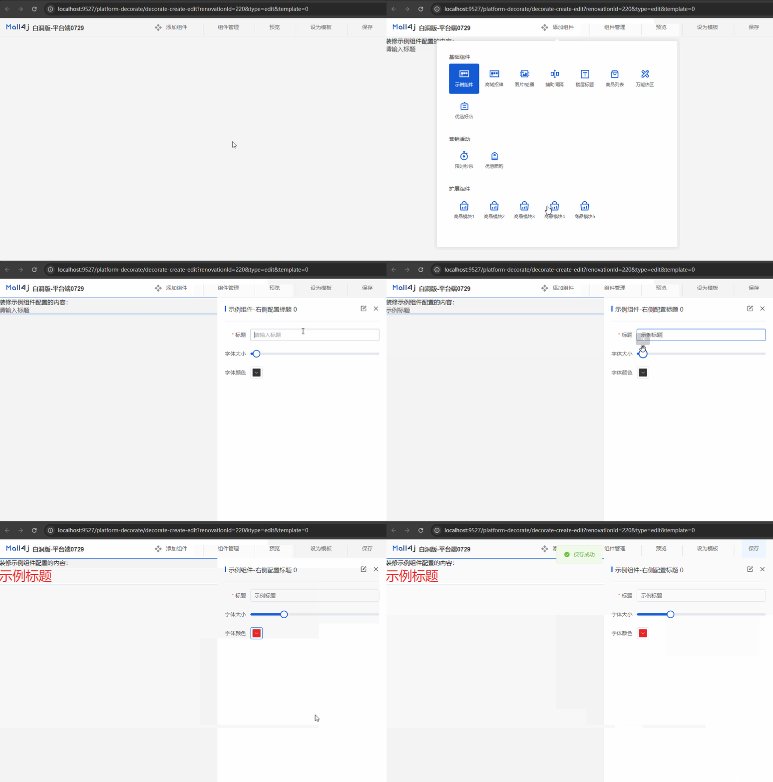
组件配置中除了组件自身实现的功能代码以及对应的校验代码外,大多数代码可以参考现有组件编写,需要注意要修改下组件类型(type)的值。
至此,后台管理端PC的组件添加已经完成:
添加组件到预览页面
Section titled “添加组件到预览页面”在装修页面列表中的有查看的功能,需要把组件引入到 platform/decorate/create/select-decorate/index.vue
<script setup>// 其他引入 ...
import exampleComponent from '../edit/components/basic-component/example-component/index.vue' // 示例组件
// 组件管理const com = shallowReactive({  exampleComponent,  ...})</script>
PC项目中添加组件
Section titled “PC项目中添加组件”后台管理新增组件完毕后,要在PC项目中也添加对应的组件用来在前端界面渲染。PC项目装修组件目录为 src/components/decorate-component
渲染的组件已经在后台管理系统中写好了,理论上只需要将 example-component 组件从后台管理系统项目拷贝到该目录下,然后移除组件目录下的 components 配置就可以了。
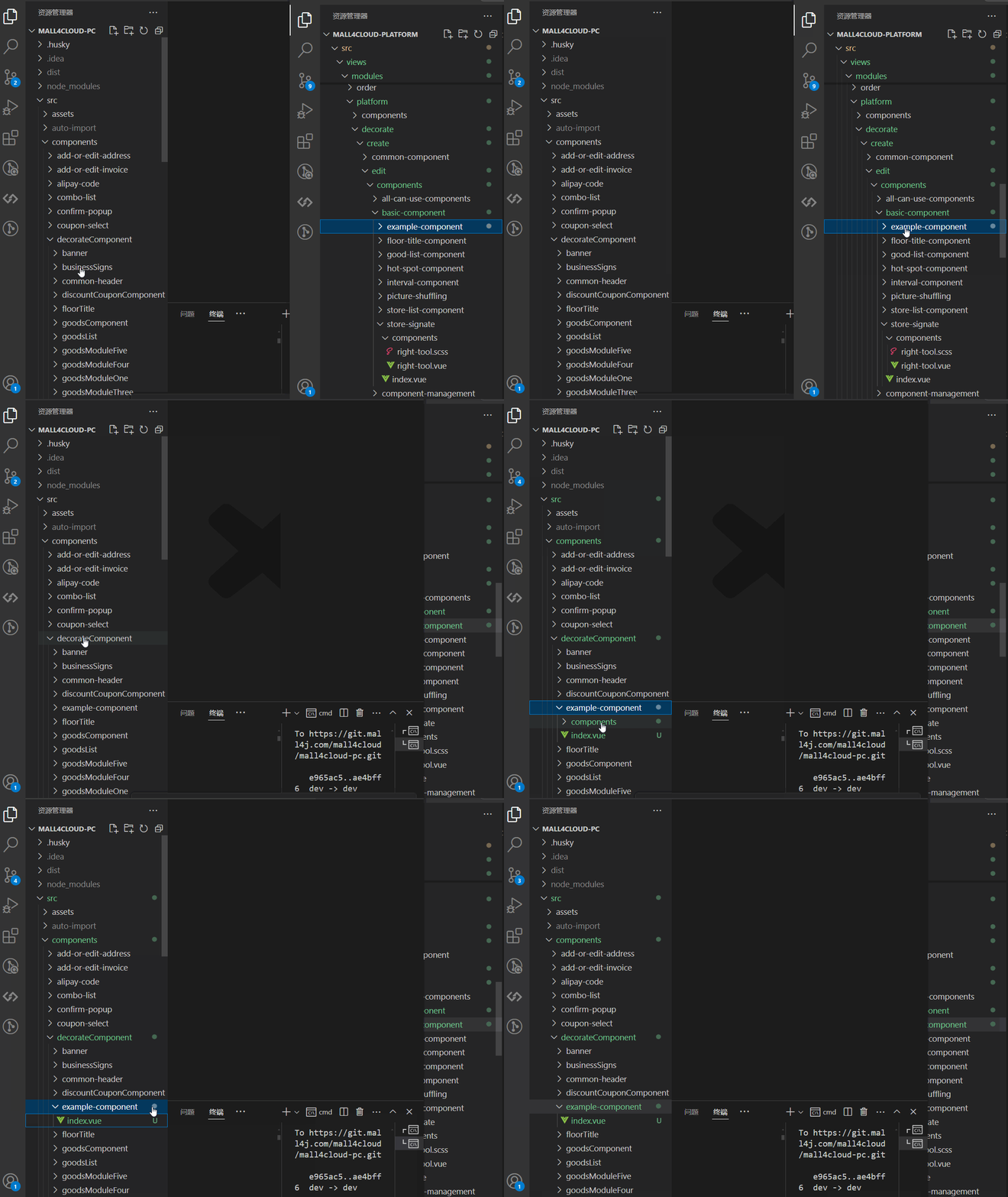
PC端添加组件后同样需要在组件配置中添加该组件的类型,plugins/pageConfig.js 添加代码
// 组件的配置export const configComponentList = [ { type: 'example_component', // 组件唯一标识 components: 'exampleComponent', // 组件名称 rightConfigMessage: {} }]打开 scr/components/new-index 组件,把新增的组件引入
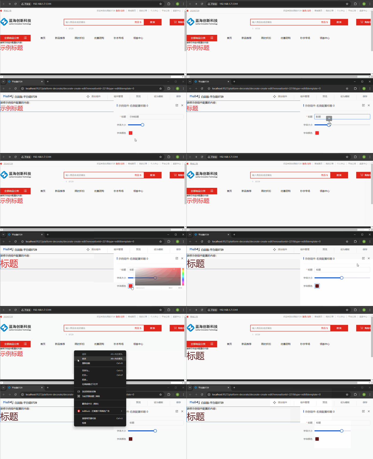
<script setup> import exampleComponent from '@/components/decorateComponent/example-component/index.vue' const comRouteData = reactive([ { name: 'exampleComponent', routerPath: shallowRef(exampleComponent) }, ... ])</script>至此PC端自定义装修组件就完成了,在后台管理系统-装修功能-PC端装修-页面管理中把该组件添加到设为主页的装修页中,就可以看到效果
移动端自定义装修组件
Section titled “移动端自定义装修组件”移动端组件装修目录
Section titled “移动端组件装修目录”在后台管理项目中,移动端装修功能目录: 商家端: /src/views/modules/multishop/feature/create ,平台端: /src/views/modules/platform/feature/create
目录概览:
create├─edit 新增、编辑装修页│ └─components 所有的装修组件└─RightPanel在 /feature/create/edit/components 目录创建一个新的组件,并写入以下代码:
提示:在新增组件的时候可以使用以下代码作为模板,然后在 组件功能预览区域 和 组件配置 补充功能代码并完善校验等内容即可。
<template>  <div class="Mall4j component-example-component">    <!--  组件预览区域  -->    <div class="design-preview-controller">      组件功能预览区域    </div>    <!--  右侧组件配置内容  -->    <div      v-show="isShowEdit"      class="design-editor-item design-hide-class"    >      <div class="design-config-editor">        <div class="design-editor-component-title">          <!--     组件标题 & 自定义标签     -->          <div style="flex: 1;">            右侧配置区域标题            {{ currentComponent.customRemark }}          </div>          <!--     修改自定义标签弹窗     -->          <custom-remark-edit-popover            :index="currentUseComponents.findIndex(item => item.id === currentComponent.id)"            :current-edit-component="currentEditComponent"            @set-current-component="setCurrentComponent"            @save-edit="saveCustomRemark"          />        </div>        <!--    组件配置    -->        <div class="design-editor-component-container">          当前组件的配置        </div>      </div>    </div>  </div></template>
<script setup>import customRemarkEditPopover from '../../../../../components/custom-remark-edit-poppver/index.vue'const props = defineProps({  isCheckMySelf: { // 是否开始内部验证 比如提示弹窗等。。。    type: Boolean,    default: false  },  currentComponent: { // 当前组件    type: Object,    default: () => {      return {}    }  },  indexKey: { // 当前组件排序索引 type_ + key    type: String,    default: () => {      return ''    }  },  current: { // 当前排序索引 key    type: Number,    default: () => {      return null    }  },  isShowEdit: { // 是否为编辑状态    type: Boolean,    default: false  },  dataField: { // 所有上传到后端的字段    type: Object,    default: () => { }  },  isStartCheckFieldRules: { // 是否开始校验规则    type: Boolean,    default: () => false  },  currentUseComponents: {    type: Array,    default: () => {}  }})const emit = defineEmits(['myCheckResult', 'componentsValueChance', 'onErrorMessageTip'])
</script>
<style lang="scss" scoped>
</style>
与PC的组件类似,创建完成后需要引入到公共的组件列表中,并完成配置:
feature/create/edit/components/all-can-use-components/compRouterData.js
// ..其他引入import exampleComponent from '../example-component/index.vue'
// 注意配置组件的时候在第二项后插入,因为前两项为头部组件,根据索引有部分操作,如果写在之前会导致不可预料的问题export const componentLists = [  {    type: 'config', // 组件名称标识    title: $t('shopFeature.allCanUse.config'),    isHide: true, // 是否隐藏选择    isHeader: true, // 是否为头部    routerPath: shallowRef(header) // 路由地址  },  { // 公共广告头部配置    type: 'config_common_ad',    title: $t('shopFeature.allCanUse.config'),    isHide: true, // 是否隐藏选择    isHeader: true, // 是否为头部    routerPath: shallowRef(headerAD)  },  // 配置新增的组件信息  {    type: 'example_component', // 组件类型,唯一标识    title: '演示组件', // 组件标题名称    pic: pTextPng, // 组件图标    picActive: pTextActivePng, // 激活时的组件图标    routerPath: shallowRef(exampleComponent) // 组件地址  }  // ...]
新增的组件默认添加到 基础组件 一栏
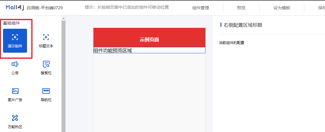
如果要进行分组处理,根据之前设置的组件类型在 feature/create/edit/components/all-can-use-components/index.vue 中的组件分组方法中操作:
/** * 组件分组 */const groupcomponent = () => { const baseListPar = [] const shopDisListPar = [] const extendComponentPar = [] for (let i = 0; i < componentLists.value.length; i++) { const item = componentLists.value[i] if (item.type === 'promotionalActivities' || item.type === 'goods' || item.type === 'goodsWaterfall') { shopDisListPar.push(item) } else if (item.type === 'goodsModule1' || item.type === 'goodsModule2' || item.type === 'goodsModule3' || item.type === 'goodsModule4' || item.type === 'goodsModule5') { extendComponentPar.push(item) } else { baseListPar.push(item) } } baseList.value = baseListPar shopDisList.value = shopDisListPar extendComponentList.value = extendComponentPar}添加组件功能
Section titled “添加组件功能”注意:移动端装修组件的预览内容和配置区域都在同一个文件中,这与PC装修有所不同。
假设当前组件需要实现一个配置标题的功能,可以配置文本内容、字体的大小和颜色:
在 组件预览区域 和 组件配置 添加代码,并完善校验:
<template>  <div class="Mall4j component-example-component">    <!--  组件预览区域  -->    <div class="design-preview-controller">      <div        class="title-text-title"        :style="{fontSize:formData.titleFontSize+'px', color:formData.titleColor}"      >        {{ formData.title || '请输入标题' }}      </div>    </div>    <!--  右侧组件配置内容  -->    <div      v-show="isShowEdit"      class="design-editor-item design-hide-class"    >      <div class="design-config-editor">        <div class="design-editor-component-title">          <!--     组件标题 & 自定义标签     -->          <div style="flex: 1;">            右侧配置区域标题            {{ currentComponent.customRemark }}          </div>          <!--     修改自定义标签弹窗     -->          <custom-remark-edit-popover            :index="currentUseComponents.findIndex(item => item.id === currentComponent.id)"            :current-edit-component="currentEditComponent"            @set-current-component="setCurrentComponent"            @save-edit="saveCustomRemark"          />        </div>        <!--    组件配置    -->        <div class="design-editor-component-container">          <!-- 当前组件的配置 -->          <el-form            ref="formDataRef"            :model="formData"            :rules="formRules"          >            <el-form-item              label="标题内容"              prop="title"            >              <el-input                v-model="formData.title"                placeholder="请输入标题内容"              />            </el-form-item>
            <el-form-item label="标题颜色">              <el-color-picker v-model="formData.titleColor" />            </el-form-item>
            <el-form-item label="标题大小">              <el-slider                v-model="formData.titleFontSize"                :min="12"              />            </el-form-item>          </el-form>        </div>      </div>    </div>  </div></template>
<script setup>import customRemarkEditPopover from '../../../../../components/custom-remark-edit-poppver/index.vue'const props = defineProps({  isCheckMySelf: { // 是否开始内部验证 比如提示弹窗等。。。    type: Boolean,    default: false  },  currentComponent: { // 当前组件    type: Object,    default: () => {      return {}    }  },  indexKey: { // 当前组件排序索引 type_ + key    type: String,    default: () => {      return ''    }  },  current: { // 当前排序索引 key    type: Number,    default: () => {      return null    }  },  isShowEdit: { // 是否为编辑状态    type: Boolean,    default: false  },  dataField: { // 所有上传到后端的字段    type: Object,    default: () => { }  },  isStartCheckFieldRules: { // 是否开始校验规则    type: Boolean,    default: () => false  },  currentUseComponents: {    type: Array,    default: () => {}  }})const emit = defineEmits(['myCheckResult', 'componentsValueChance', 'onErrorMessageTip'])
// 当前页面展示的配置const formData = ref({  title: '',  titleColor: '#333',  titleFontSize: 16})
const formRules = ref({  title: [    { required: true, message: '标题不能为空', trigger: 'blur' }  ]})
watch(() => props.dataField, (val) => {  if (val) {    setFormData()  }}, { deep: true })
/** 设置或者重设formData的数据 */const setFormData = () => {  if (props.dataField) {    for (const el in props.dataField) {      formData.value[el] = props.dataField[el]    }  }}
watch(() => formData.value, (val) => {  if (val) {    emit('componentsValueChance', {      indexKey: props.indexKey,      current: props.current,      dataField: val    })  }}, { deep: true })
watch(() => props.isStartCheckFieldRules, () => {  startCheckFieldRulesCommonFun()}, { deep: true })
onMounted(() => {  setFormData()})
/* 校验 */const startCheckFieldRulesCommonFun = () => {  let isPass = true  let errorMessage = ''  if (!formData.value.title.trim()) {    isPass = false    errorMessage = '标题不能为空'  }
  if (isPass) {    myCheckResult(isPass)  } else {    // element 表单校验    showCheckForm()    // 弹窗提示错误消息    emit('onErrorMessageTip', errorMessage)  }}
/** * 返回校验结果 * isHeader 是否为顶部 特殊情况 * 结果:Boolean true false * */const myCheckResult = ($isPass) => {  emit('myCheckResult', {    data: {      isPass: $isPass,      dataField: props.dataField,      isHeader: (props.currentComponent.type.indexOf('config') !== -1),      current: props.current    }  })}
const formDataRef = ref(null)/** * 可选 * 当子组件不符合规则时,是否调用element ui 默认的规则判断 * 需要默认结构为form * */const showCheckForm = (cb) => {  nextTick(() => {    if (formDataRef.value) {      formDataRef.value.validate((valid) => {        if (valid) {          if (cb) cb(valid)        } else {          if (cb) cb(valid)        }      })    }  })}
</script>
<style lang="scss" scoped>
</style>
在后台管理端的移动端装修组件就完成了,接下来就是在uniapp项目中添加对应的渲染组件来把这它展示出来
uni项目中添加组件
Section titled “uni项目中添加组件”移动端项目中装修组件路径为:src/components/feature/all-feature
在此目录中创建 example-component 组件,并写入以下内容:
<template>  <view class="Mall4j example-component">    <view      :style="{        color: fieldData.titleColor,        fontSize: fieldData.titleFontSize + 'px'      }"    >      {{ fieldData.title }}    </view>  </view></template>
<script setup>defineProps({  fieldData: {    type: Object,    default () {      return {}    }  }})
</script>
创建好组件后把它引入到装修组件列表,并完成配置即可;
打开 src/components/feature/feature.vue,在以下位置补充代码:
<template>  <view class="Mall4j micro-box">    <view      v-for="(item, index) in list"      :key="index"    >      <!--   新增的示例组件   -->      <!--   v-if判断中type为后台管理新增时指定的组件唯一标识   -->      <example-component        v-if="item.type === 'example_component'"        :field-data="item.dataField"      />    </view>  </view></template>
<script setup>// 其他引入// 引入新增的组件import exampleComponent from './all-feature/example-component/index.vue'...</script>
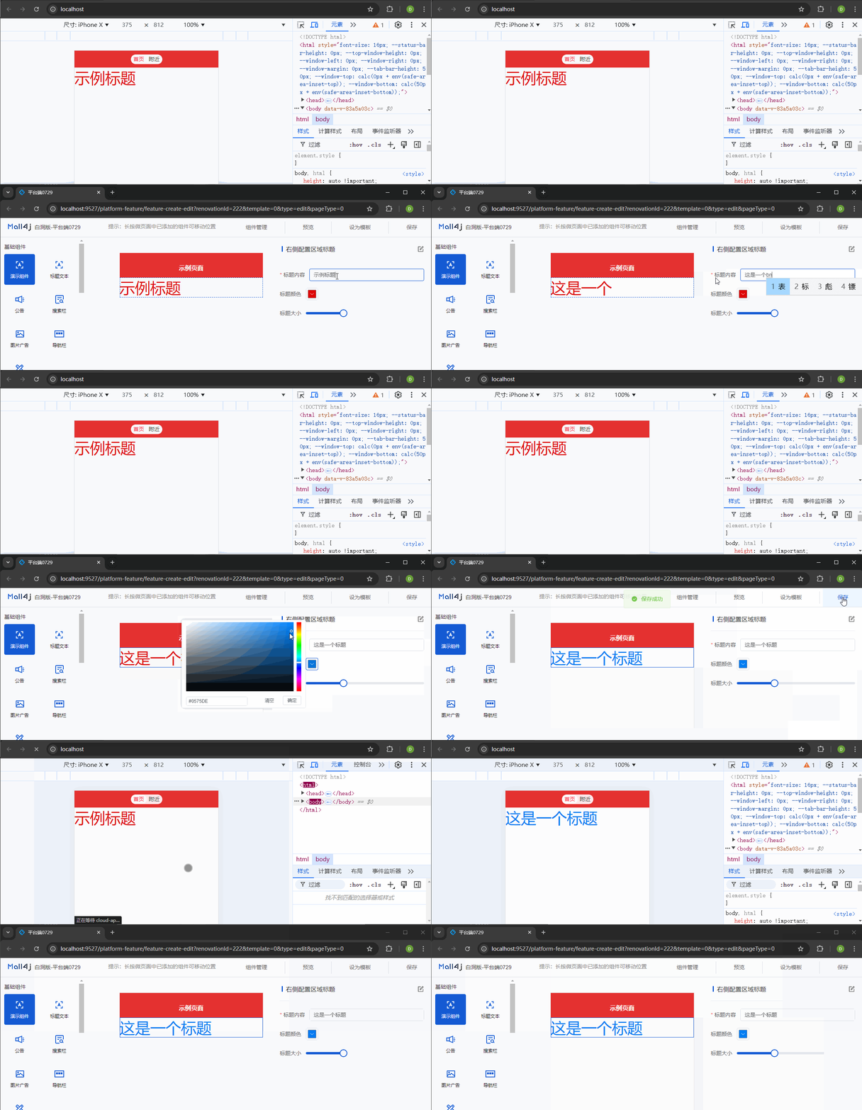
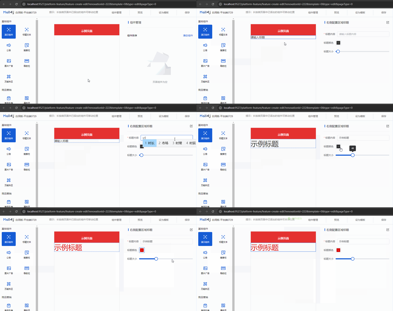
到这一步移动端自定义装修组件就完成了: